How to use images as controls
A how-to guide for using images as controls in the solution.
Introduction
Would you like to use a control panel that include images to represent different values? Then add a SelectImage control using images to your solution by following these steps.
Prerequisites
- You configured the frames and routes for your solution.
- You configured the relevant contents such as the model(s), control panel(s), viewer(s) and datastore.
- You saved the images you’d like to use as controls to your solution folder.
1. Configure a selection control
- Define a control with
kind: SelectImage. - Define the choices with
kind: Image, their value, label and relevant image path.
my-image-selection:
  kind: SelectImage
  label: My image selection
  value: "2"
  choices:
    - kind: Image
      label: image 1
      value: "1"
      imagePath: my-image-ph.png
    - kind: Image
      label: image 2
      value: "2"
      imagePath: my-image-ph.png
2. Set the right size for your image
To display the image choices correctly, the layout width and itemheight should be exactly right based on the sizes of your images (px).
- Note down the widths and heights of your images in pixels.
- The
itemHeightshould be equal to the height of the images. - The width of the relevant area in your layout can be calculated with the formula below:
area-width = 40 + (image-width * number-of-columns) + (6 * (number-of-columns - 1))
The configuration should look similar to the example below:
my-home-frame:
  kind: Frame
  layout:
    kind: ColumnLayout
    widths:
      [auto, 583px] #use the formula to calculate the width of the control panel

    areas:
      ["",my-params]
  contents:
    my-params:
      kind: ControlPanel
      controls:
        my-image-selection:
          kind: SelectImage
          label: My image selection
          value: "2"
          itemHeight: 100
          numberOfColumns: 1
          choices: ...
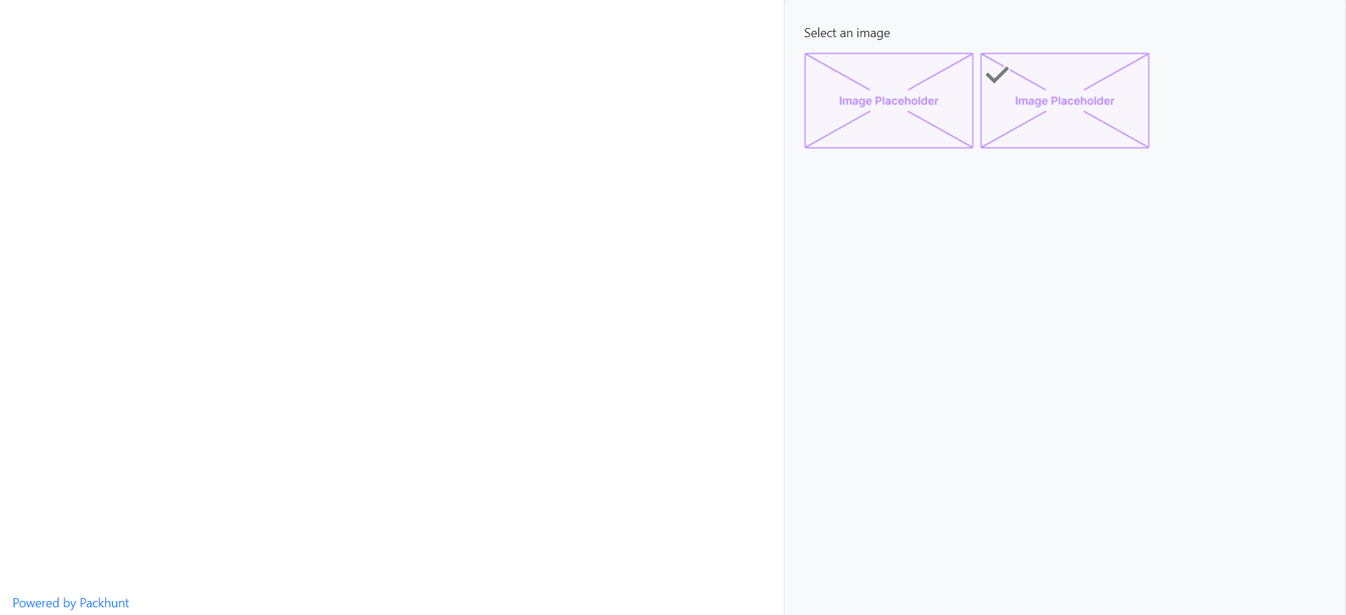
See the image below as an example.

Configuration
See the SelectImageControlConfig configuration docs and imageChoiceConfig configuration docs for more information.