Layout
Layout allows you to organise the contents of the user interface.
Layout is used to define the location and size(s) of certain items like blocks, controls, navigation items in the Frame, ControlPanel, and NavPanel respectively. For example, a viewer’s location in the frame is defined in the layout.
To configure a layout, the areas and their sizes should be defined. The sizes of the areas can be measured in fractions (fr), percentages (%) and pixels (px).
💡Fractions divide the total area into proportional strips. Using fr units allows for responsive layouts since the areas scale up or down based on the display size.
💡To leave areas empty (white space), you can use empty strings ("").
areas: [viewer, ""]
There are 3 layout kinds and depending on the layout kind, the required properties change.
Column Layout
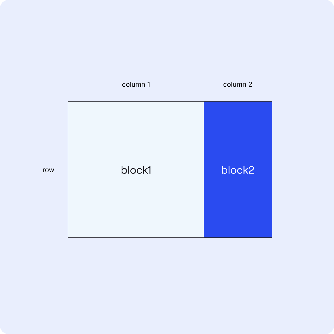
Column layouts are based on the number of columns and their widths. In the example below the frame has a layout with two different blocks organised horizontally.
  layout:
    kind: ColumnLayout
    widths: [2fr, 1fr]
    areas: [block1, block2]

Row Layout
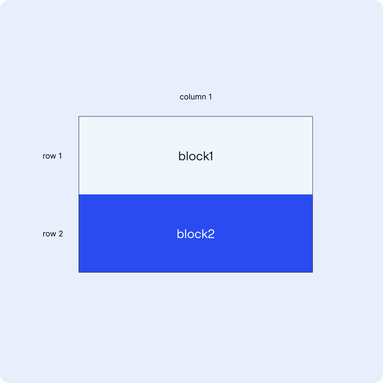
Row layouts are based on the number of rows and their heights. In the example below the frame has a layout with two different blocks organised vertically.
  layout:
    kind: RowLayout
    heights:
      - 1fr
      - 1fr
    areas:
      - block1
      - block2

Grid Layout
Grid layouts are a combination of row and column layouts. It provides flexibility for using both columns and rows to define the layout.
The areas are defined row by row for grid layouts.
💡 You can combine areas in the layout. For example, a block can span 2 or more areas, if it needs to be larger than the layout divisions. Note that the combined area should be rectangular, L-shapes are not allowed.
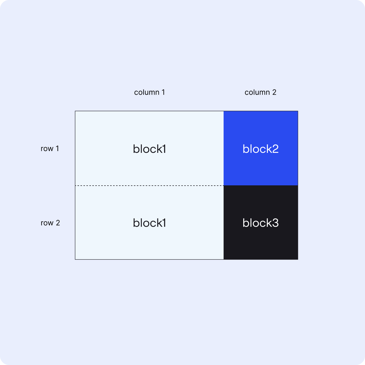
In the example below, the same block is assigned to 2 areas right below each other, therefore that block takes more space and appears as one.
  layout:
    kind: GridLayout
    widths: [2fr,1fr]
    heights:
        - 1fr
        - 1fr
    areas:
        -[block1, block2]
        -[block1, block3]

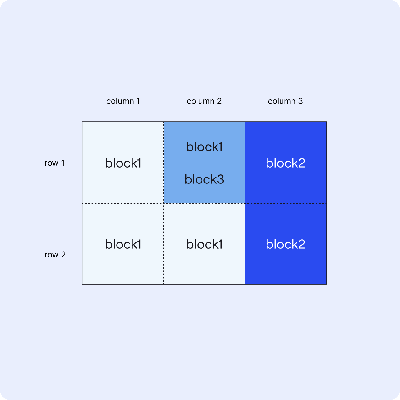
Overlay areas can be added to grid layouts to overlap contents on others.
💡The areas and overlay areas need to have the same structure of columns and rows.
  layout:
    kind: GridLayout
    widths: [2fr, 1fr, 2fr]
    heights:
        - 1fr
        - 1fr
    areas:
        -[block1, block1, block2]
        -[block1, block1, block2]
    overlayAreas:
        -["", block3, ""]
        -["", "", ""]
