How to add bar charts
Introduction
Would you like to display and compare calculation results visually? Then add a bar chart to your solution by following these steps.
Prerequisites
- You configured the frames and routes for your solution.
- You configured the relevant contents such as the model(s), viewer(s) and datastore.
- You have a Rhino Grasshopper definition using the Packhunt input components.
1. Add a chart
- Add a block with
kind: Chart. - To define how it looks, configure its
settings.- Define the type of the chart
kind: BarChart. - Set
modetoComparative.
- Define the type of the chart
- Define the tags for the vertical and horizontal axis with
xAxisLabelandyAxisLabel.
The configuration should look similar to the example below:
my-chart:
  kind: Chart
  settings:
    kind: BarChart
    mode: Comparative
    xAxisLabel: Surfaces
    yAxisLabel: Area (m2)
2. Output chart properties as JSON in Grasshopper
To define the colours, domain and the values of the bar chart, compile a JSON in Grasshopper. To create the JSON, you can use the Packhunt JSON components.
You can created a simple barchart or a grouped bar chart by using single or multiple series respectively.
Single series
To show one column per tag, single series can be used.
- Compile chart data by defining:
idneeds to be a unique number or stringtagdefines the label shown below the column barvaluedefines the height of the column barseriesdefines the group for the column bar, this value is used for assigning colours to the columns afterwards. For a simple bar chart, there is only one series.
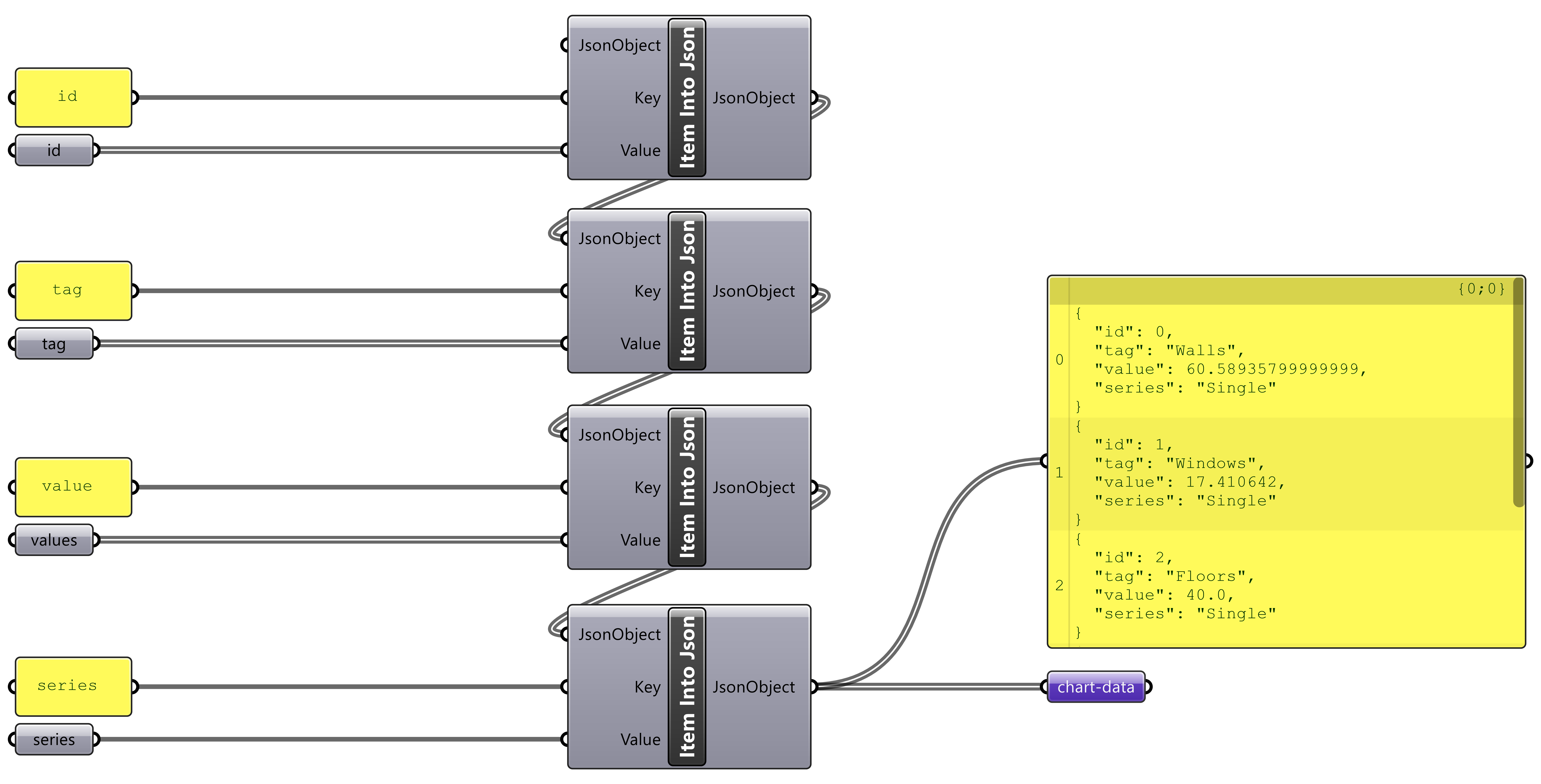
- Compile chart colours by defining which series has that colour and the RGB value of the colour following the
“my serie” : “rgb(my-r,my-g,my-b)”format.
For assigning colours to a single series, the chart colours output would look like the image below

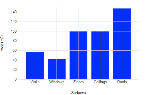
- Define the range of values on the vertical axis by outputting the domain.

See the image below as an example for single series barchart.
Multiple series
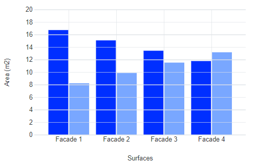
To show multiple columns for the same tag, multiple series can be used.
-
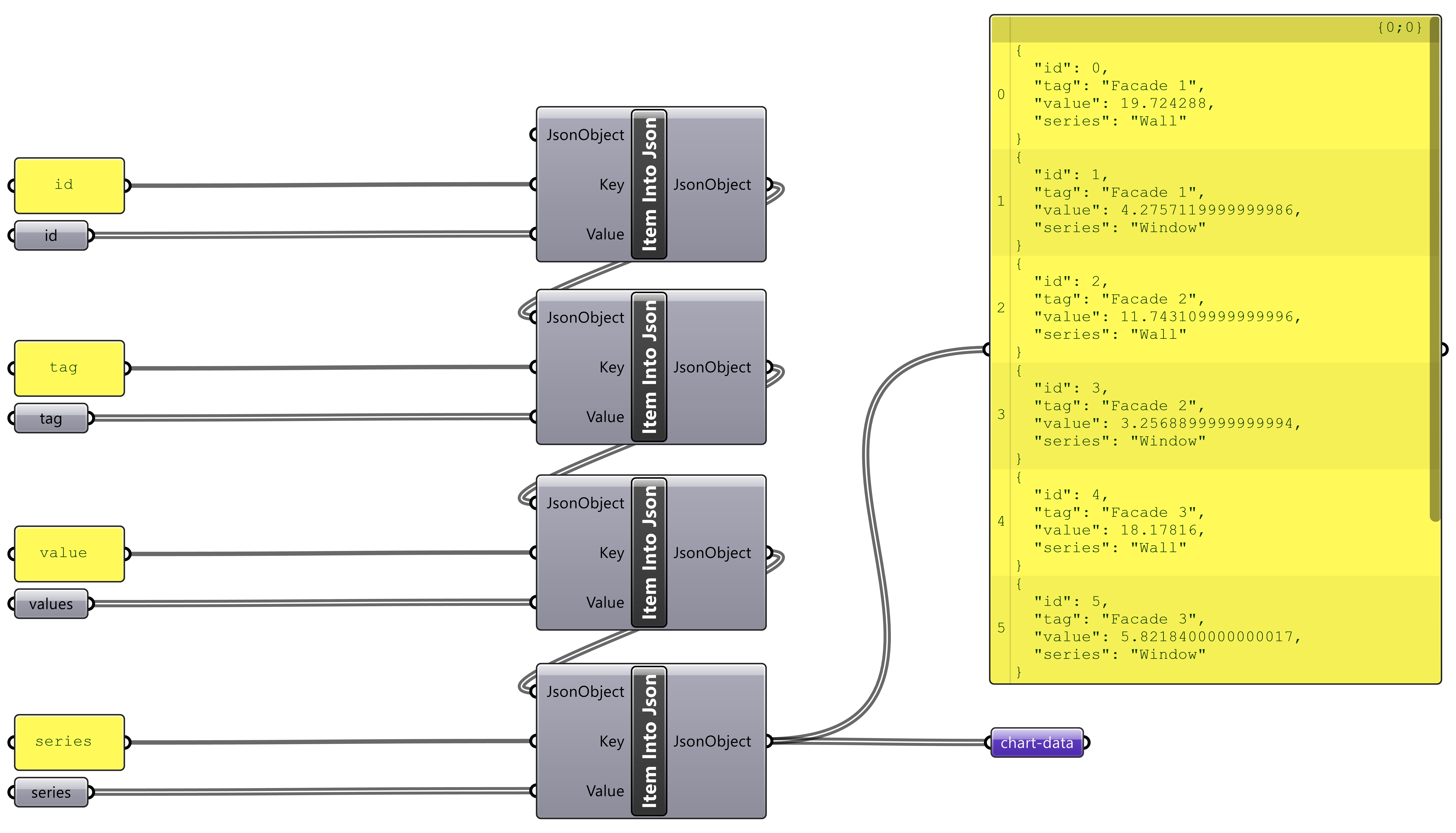
Compile chart data by defining:
idneeds to be a unique number or stringtagdefines the label shown below the column groups.valuedefines the height of the column barseriesdefines the columns in the group, this value is used for assigning colors to the columns afterwards. For a grouped bar chart, series repeat with each tag.
For example to show the wall and window area on different facades the JSON output would look like the image below.
-
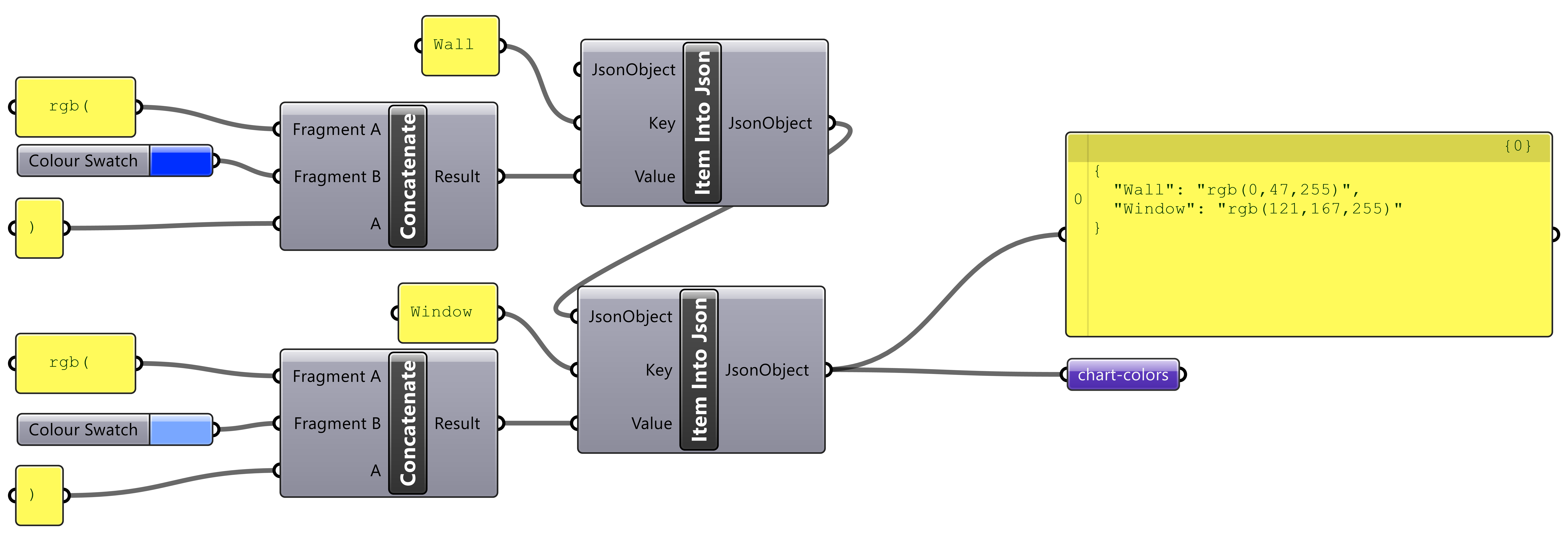
Compile chart colours by defining which series has that colour and the RGB value of the colour following the
“my serie” : “rgb(my-r,my-g,my-b)”format. For assigning colours to multiple series, the chart colours output should look like the image below.
-
Define the range of values on the vertical axis by outputting the domain.

-
See the image below as an example for multiple series barchart.
3. Subscribe the chart to the model
To retrieve the chart properties from the model,
- Subscribe the chart to the model.
- Define the
frameandsource. - Set the
actiontoSetChartProps.- Define the Grasshopper output to use as
chartData. - Define the Grasshopper output to use as
chartColors. - Define the Grasshopper output to use as
chartColors. - Define the
chartDomainswith the name of the Grasshopper data output component’s name and thevalue.
- Define the Grasshopper output to use as
my-chart:
  kind: Chart
  settings:
    kind: BarChart
    mode: Comparative
    xAxisLabel: Surfaces
    yAxisLabel: Area (m2)
    subscribe:
      - kind: Model
        frame: home-frame
        source: my-model
        action: SetChartProps
        chartColors: chart-colors
        chartData: chart-data
        chartDomains:
          chart-domain1: value
Next Steps
To add a legend for the bar chart colours, see the how to add a legend guide.
Configuration
See the chart configuration docs for more information.